Andras
A little about me and my journey
Thank you for visiting my webpage! I'd love to share a bit about my coding journey and
myself.
I've always had an interest in IT and electronics, but it was about five years ago that
I developed a deep passion for coding. Since then, I've made it a daily habit to study
and practice, despite the sacrifices, like cutting back on gaming and skipping some gym
classes. Balancing a full-time job with limited free time hasn't been easy, but I've
never looked back. There's something incredibly rewarding about researching, solving
problems, and creating solutions that keeps me motivated.
Outside of coding, I like to stay active with Thai boxing, longboarding, and
photography. I also love keeping up with IT and hardware developments—it's amazing how
far we've come since the Commodore 64! I'm fascinated by astronomy (especially the James
Webb telescope), physics, psychology (with a focus on deviant behaviors), and even
chemistry on occasion. Music has been a lifelong passion of mine; I've been collecting
records since childhood and learned to play the drums as a teenager. At one point, I
even considered becoming a professional drummer. I'm still passionate about discovering
new music and attending concerts whenever I can.
As you can see, my interests are quite broad, which might be tied to my INFJ personality
type. Thanks for taking the time to learn a bit about me, and I wish you all the best!
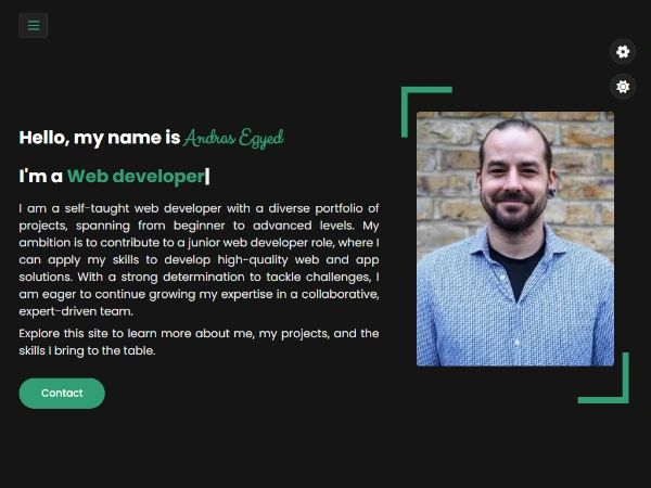
Hello, my name is Andras Egyed
I'm a Web deve
I am a self-taught web developer with a versatile portfolio, showcasing projects from beginner to
advanced levels. I am
continuously learning and refining my skills, driven by curiosity and a passion for growth. I enjoy
tackling challenges
and expanding my expertise in web and app development, exploring new technologies and creative
solutions along the way.
Explore this site to learn more about my projects, experience, and the skills I bring to the table.


About Me
I'm Andras Egyed a Web Developer
Over the past five years, I’ve made web development a part of my daily routine, balancing self-study with hands-on projects. This consistent practice has helped me build practical skills, gain experience, and steadily grow my confidence as a developer.
HTML / CSS
Bootstrap, Tailwind
JavaScript
React
Redux / RTK
React - Native
Vue
TypeScript
Experience
2023 - 2025
Rota Coordinator
In my current position, I manage and oversee a complex rota system for the company. My responsibilities include coordinating GP and ANP appointment rotas for up to 500 clinicians, working closely with the patient experience team and HR to enhance processes, managing teams, and supporting short- and mid-term action plans. I also ensure compliance with service level agreements. To accomplish these tasks, I utilize a range of management tools such as Quinyx, Dynamics, Jira, Power BI, and a detailed Miro board for team leadership.
2021 - 2023
Deputy manager / Care Coordinator
As Deputy Manager, I was responsible for both daily operations and long-term strategic planning. I ensured the quality of care and support services for clients aligned with business goals and financial sustainability. My duties included monitoring workflows, analyzing client satisfaction, and managing internal CRM and workflow systems using PASS and Staffplan.
2020 - Present
Care Coordinator
In my role as a Care Coordinator at Caremark, I focused on planning and organizing daily operations, maintaining digital records for workflows, staff, and clients, and ensuring compliance with all internal systems and procedures. Additionally, I provided senior management with reports on budget allocation, staff development, and client growth.
2018 - 2019
Field Care Supervisor
I began my career at Caremark as a Field Care Supervisor, where I monitored and supervised care workers in the field. I also mentored them through daily challenges and professional development. A key part of my role was conducting training sessions and practical inductions to maintain the high quality of care provided by the business.
2012 - 2018
Various Positions
Moving to the United Kingdom presented challenges in language, skills, and education. During this time, I gained experience in a variety of service and logistical roles, including shop assistant, gardener, and support worker, among others.
2010 - 2011
School Teacher
My career began in education, following in the footsteps of my grandparents who were also teachers. I taught arts and crafts to fifth and sixth graders, helping them develop their creativity. I played a leading role in organizing school events, which involved idea generation, event preparation, activity coordination, and security management.
Education
2024 - 2025
Typescript Bootcamp: Beginner To Advanced (2024 Edition)
Recently, I completed a Typescript Bootcamp that focused on in-depth theory and hands-on projects, including building a Node.js REST API with Express and TypeORM. I applied this knowledge to build my latest project.
2023-2024
Self-study
After completing the Udemy Web Development Bootcamp , I began building projects to gain hands-on experience. I started with a React app using Firebase and multi-auth methods, including OTP. Then I built my portfolio, sharpening my CSS, JS, and DOM skills. Expanding into TypeScript and Redux, I created a React/RTK calculator. Earlier this year, I developed a React Native real-time chat app with auth, user settings, and push notifications. Most recently, I built a React website for a tattoo artist using styled-components, React-Scroll, Framer Motion, and Lottie. It detects browser language and theme preferences, is PWA-ready, and installable on both mobile and desktop.
2022-2023
The Complete 2022 Web Development Bootcamp
This course provided a solid foundation in both front-end and back-end development, covering technologies like HTML5, CSS3, JavaScript, Node.js, React, MongoDB, and more. Web Development Bootcamp
2019 - 2020
Managment & Leadership in Health Care (Level 5)
This 1.5-year qualification focused on leadership and management in health and social care. It developed my ability to lead teams and businesses, with practical applications towards a CQC application for state-qualified managers in healthcare.
2016 - 2017
Diploma in Health & Social Care (Level 3)
This course enhanced my leadership skills and knowledge in communication, safeguarding, and team development, helping me advance in health and social care management.
2005 - 2009
Primary Teacher BA
I earned a Bachelor in Primary Teaching, specializing in Pedagogy and Psychology. This degree qualifies me to teach various subjects to children aged 7-11, and arts to teens aged 11-13.
2004 - 2005
Mathematics and Informatics (2 semester)
I briefly studied mathematics and informatics but found that the scientific level of these subjects wasn't the right fit for my career path at the time.
Expertise
Experience with coding languages, libraries, and tools.
Throughout my training, I gained practical and theoretical knowledge in key web development languages like HTML, CSS, JavaScript, and React. This has provided me with a strong foundation in the field. I am eager to build on this experience and collaborate with a team of experts to continue developing and growing.
Projects
Few of my last projects and a future plan

Contact
Do you have any questions?
Please feel free to contact me!
Send me an email!
I will get back to you as soon as possible.
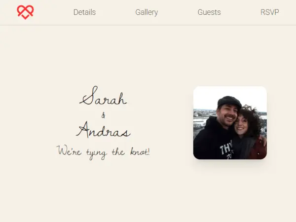
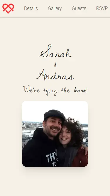
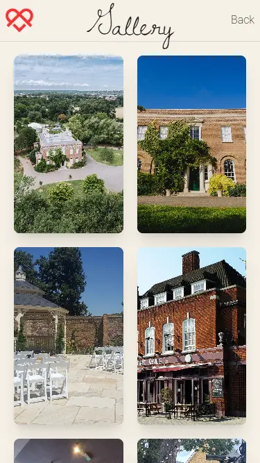
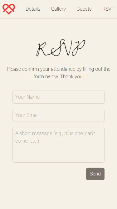
Knot - We are getting married!
React/TypeScript & Tailwind wedding website
I'm getting married, and this is our official wedding website! Built with React, it`s a central hub for all event details, RSVPs, and guest entertainment. The site features a sleek, multi-page design with smooth transitions powered by @react-spring/web and fast content loading via React.lazy and Suspense, all wrapped in a responsive, accessible layout. RSVPs are handled through Formspark, automatically sending confirmation emails via Make.com, while Firebase powers the gaming arcade, tracking scores and leaderboards with minimal authentication. The /games route offers three custom, themed games (Memory, Flappy-style, and Puzzle) for guests to enjoy. PWA-ready with offline caching, SEO-optimized, and installable on any device.
Key Features:
- TypeScript - Used throughout the codebase to add static typing and improve maintainability and developer experience.
- Tailwind CSS - A utility-first CSS framework for rapid development of responsive, clean designs.
- Firebase - Provides real-time database functionality for secure data syncing and profile management.
- @react-spring/web - Enables fluid, physics-based page transitions and animations.
- Framer Motion - Used for declarative animations and sophisticated UI interactions across the site.
- embla-carousel-react - Powers a highly optimized, touch-friendly carousel for galleries.
- yet-another-react-lightbox - Provides lightbox functionality for viewing gallery photos.
- canvas-confetti/react-confetti - Triggers celebratory effects, like on game completion.
- @formspark/use-formspark - Integrated for handling form submissions (RSVP feature).
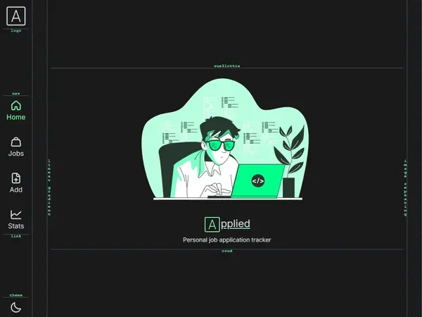
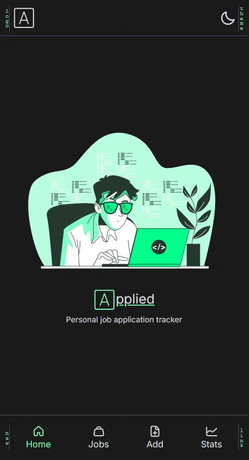
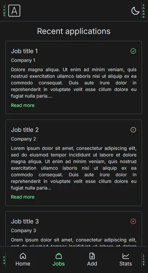
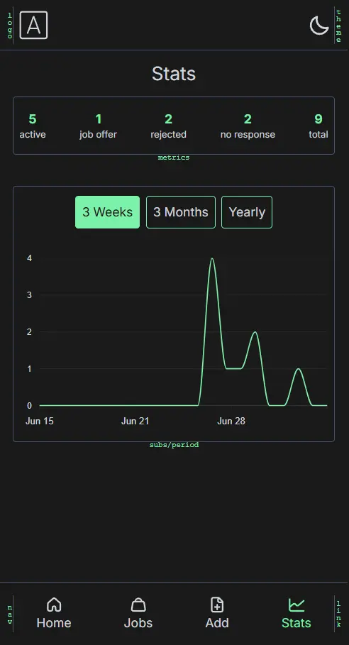
Applied (Job application tracker)
Vue3, Pinia, Tailwind and TypeScript
After applying to over 100 jobs, I realised I needed a simple, centralised way to track and manage
my applications.
Building on my recent experience with TypeScript and Vue 3, I created this job tracker app as a
personal tool and
learning project.
The project gave me a chance to explore Vue’s Composition API and compare it to React, which I’m
more familiar with.
I also styled the app entirely with Tailwind CSS v4, taking inspiration from the Vue.js and Tailwind
websites for
layout and responsiveness.
For data visualisation, I integrated ApexCharts, and Firebase handles both real-time data updates
and authentication
(admin-only for now).
AI tools like GPT and Claude played a major role throughout development, helping with logic,
debugging, and design
decisions.
The app also works as a PWA, allowing offline usage and fast load times.
For a breakdown of features, usage, and implementation details, please visit the app and click on
the logo. You will find an About section.
Key Features:
- Vue 3 + Composition API - Modular, reactive architecture with familiar React-like concepts.
- Tailwind CSS v4 - Utility-first styling for a clean, responsive UI.
- Firebase Integration - Realtime database updates and secure admin-only authentication.
- ApexCharts - Customisable, responsive data visualisation for tracking job progress.
- PWA Support - Installable on any device with offline capability and caching.
- Vue Toastification + Skeleton Loaders - Smooth feedback and user-friendly loading states.
- AI-assisted Development - GPT, Gemini,Claude, and others used to solve problems and improve efficiency.
Frost-tattoo
PWA - React App
This was my first professional project, commissioned by a tattoo studio. I invested a lot
of time to ensure it was both visually appealing and highly functional. I was fortunate
to have a client who gave me creative freedom, allowing me to design and build the
project from the ground up while learning new skills along the way.
The app is styled with styled-components, animated using React-Scroll, Framer-Motion,
React-Swipable and Lottie-React. Automatically detects the user's browser language
and preferred theme, loading with those settings by default.
Users can adjust these preferences, which are saved for future visits. It's a PWA-ready
(Progressive Web App)
, installable on both mobile and desktop for
Chromium-based browsers. I also developed a custom PWA installation flow that adapts to
the user's browser and operating system, providing installation instructions even if the
browser doesn't natively support this feature, such as adding the app to the home screen
or dock.
The project features a splash screen, hero video, testimonial slider, gallery slider,
and a gallery album. Users can easily send emails to the studio via a form with guided
prompts. The site is fully responsive and has received high scores on Lighthouse for
accessibility, best practices, and SEO.
Key Features:
- Rich Animations - Uses smooth, declarative animations and swipe gestures for interactive browsing.
- Internationalization - Supports multiple languages with automatic browser language detection.
- Responsive Design - Fully responsive and optimized for different screen sizes.
- PWA-Ready & Custom PWA Installation Flow - Installable on both mobile and desktop for Chromium-based browsers. Adapts to the user's browser and OS, providing alternative installation instructions for not natively supported browsers.
- Dynamic Sliders - Includes testimonial and gallery sliders for a seamless user experience.
- Interactive Gallery Album - Includes testimonial and gallery sliders for a seamless user experience.
- Splash Screen & Hero Video - Engages users with a polished entry experience.
- High Lighthouse Scores - Excellent ratings for accessibility, best practices, and SEO.
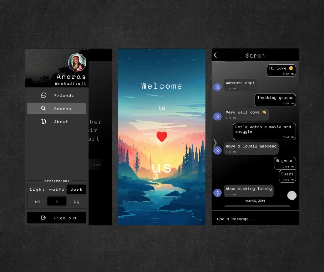
Us-App
React Native chat app
I have developed a fully functional Android chat application using React Native CLI. This
project showcases my proficiency in React Native development, having invested
significant time in learning and practicing the framework.
The application offers a seamless user experience, beginning with a splash screen that
provides a brief introduction. Upon launch, the app determines whether the user has
previously logged in. If so, it automatically restores their session. For new users or
those logging in for the first time, the app directs them to the login screen.
User preferences, such as theme and text size, are preserved across sessions. During the
initial login, the app collects essential user information (name, email, profile
picture) to create a new database entry where chat-history and friends will be stored.
The application integrates with OneSignal to enable push notifications, ensuring users
stay updated with real-time messages and events.
For a more comprehensive overview of the project, please visit the
Github repository or
explore the app's 'About' section, which can be accessed even without installation.
To download and experience the application, please click button below and
install the file (you will need to enable 3rd-party installation). Feel free to message
me if you would like to chat, search for user 'egyeand' in the app.
Key Features:
- User-Friendly Onboarding - Includes a splash screen and automatic session restoration for returning users or redirects new users to the login screen.
- User Preferences - Saves and restores theme and text-size preferences across sessions.
- Real-Time Chat - Stores chat history and friends in a real-time database.
- Push Notifications - Integrated with OneSignal for real-time message and event notifications.
- Social Authentication - Supports Google sign-in via Firebase for quick user login.
- Pop-Up Modals - Uses react-native-modal for intuitive pop-up windows.
- Seamless Animations - Features Lottie animations and React Native Reanimated for smooth transitions.
- Custom Theming - Allows users to select themes and text settings with a tri-state switch button.
- Linear Gradient Design - Implements gradient backgrounds and buttons for enhanced UI.
- Gifted Chat UI - Fully functional chat interface powered by react-native-gifted-chat.
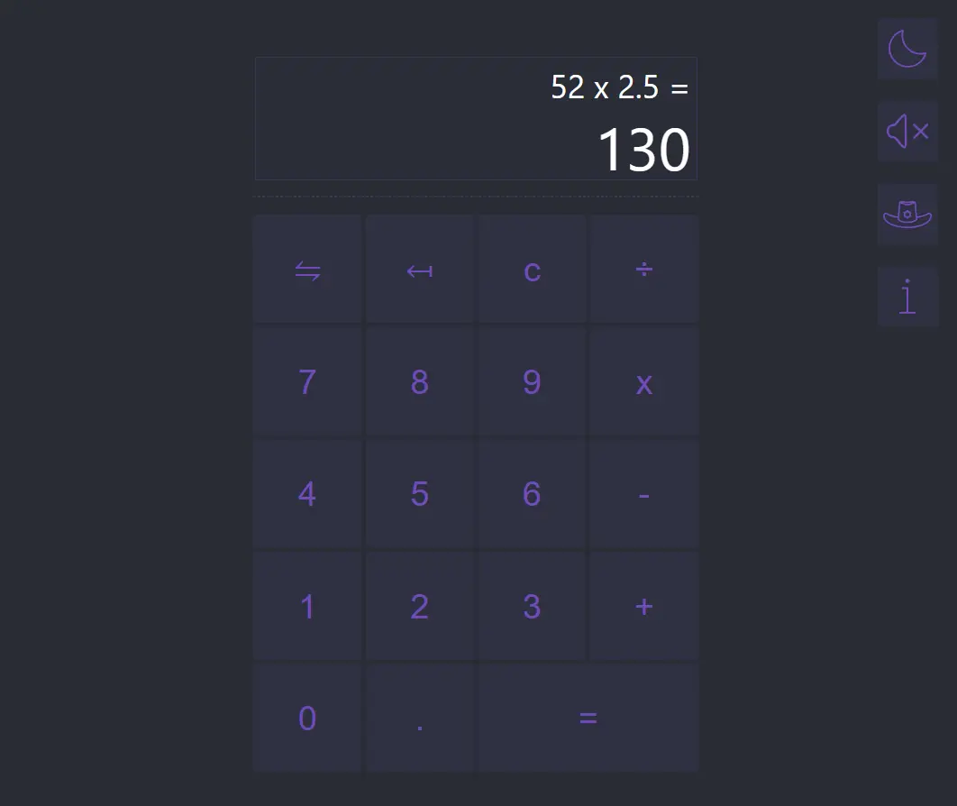
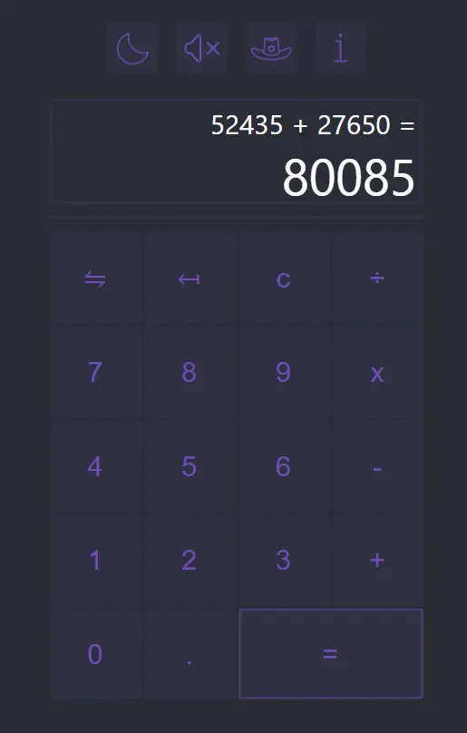
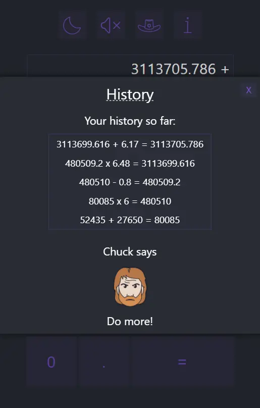
React-Redux-Calculator
React & Redux Toolkit Calculator
Building upon my knowledge of Redux and Redux Toolkit (RTK), I embarked on the creation
of a feature-rich calculator application. This project leverages a combination of
React's useState hook and Redux-RTK for robust state management.
To elevate the user experience, I meticulously replicated the logic of the Windows
calculator, encompassing functionalities such as calculation history and dynamic ongoing
calculations. Moreover, the application boasts a range of customization options,
including theme and sound settings.
For a distinctive touch, I designed a unique theme and visual style for the calculator.
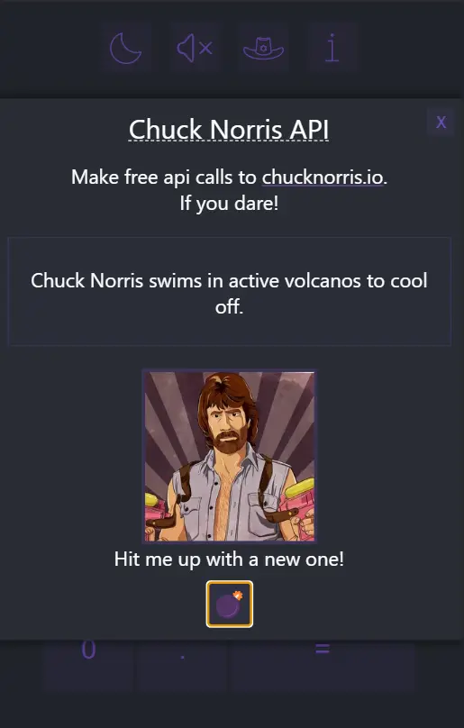
Additionally, I incorporated sound effects to enhance user interaction and integrated an
API to display motivating action hero images featuring the legendary Chuck Norris,
adding a touch of humor to the experience.
For a more in-depth breakdown of the project's evolution, features, and practical examples, please
go to the app and click on the 'i' icon. You'll find an 'About' section.
Key Features:
- Windows Calculator Logic - Replicates the core Windows calculator functionality, including real-time calculations and history.
- Persistent Settings - Saves and restores theme and sound preferences using local storage.
- Custom Themes - Allows users to switch between light and dark themes for a personalized look.
- Customizable Sound Effects - Adds button sound effects via use-sound, with an option to turn them off.
- Dynamic Font Resizing - Automatically adjusts font size for long calculations using react-textfit.
- API integration - Fetches random images from chucknorris.io for added fun.
Portfolio
Dynamic Webpage with Vanilla JavaScript and CSS
This webpage showcases my proficiency in crafting dynamic web experiences using only
vanilla JavaScript and CSS. While inspired by a YouTube tutorial. I've extensively customized and enhanced
the original design to align with my personal vision.
I began by meticulously analyzing the tutorial's code, gaining a deep understanding of
its structural and design principles. From there, I tailored the project to my specific
requirements, incorporating new elements and features such us 'swipe and tap'
functionalities with lazy loading.
As the project expanded, I aimed to improve navigation on this single-page site. To achieve this, I
organized the website into distinct sections using EJS templates. Netlify then dynamically compiles
these templates into a complete HTML file during deployment, ensuring a seamless and efficient
browsing experience.
For a more in-depth breakdown of the project's evolution and features, please click to
the 'Read More' button below.
Key Features:
- Lazy Loading - Optimizes page performance by deferring the loading of non-essential elements until they are needed.
- Embeds - The website includes embeds to display external content including Youtube, Codesandbox and Github pages.
- Swipe Functionality - Using hammer.js can recognize gestures made by touch, mouse and pointerEvents.
- Custom Animations - Smooth transitions and effects enhance the overall user experience.
- Enhanced Functionality - Additional features and interactions have been added to provide a more engaging experience.
Portfolio project
Lazyload, swipe and much more
I absolutely loved the design as it is clean, fresh and looks dynamic. I really thought by finishing the code following the tutorial will pretty much wrap up this project, but I was wrong. Very wrong!
Sections
As you can see on the site there are slides coming right to left for each link you click
on. These are sections, although it looks that they are all different components of the
page, but they are really not!
Just imagine a standard webpage as a roll of paper. As you scroll down you go through
different segments of the same paper. Now imagine this roll to be cut up into a certain
number of dimensions (sections) and start piling up these 'card/sections' on top of each
other. They all exist the same time, in front of each other, but most of them get hidden
away by the first card. As the new section slides in, the previous one stays in the
back. Each slide will have classes such as 'hidden', 'back-section' or 'active' when
required.
When I finished the initial project, I realized there is an issue while loading the
page. The last slide that loads will be visible for a second and kind of ruining the
initial animation. An easy fix would be to add an empty black section (without any
characters, pictures or other elements) as the last card. When the
DOM
(document object model) gets loaded it will be the last card on top. The Home section is
'active' so will slide over it - that makes it look pretty neat. The problem with this
solution is that as the DOM (Document Object Model) grows bigger and starts running the
project not only locally, it will require more time for the DOM to load in, so for the
trace of the second flashing-up some of the sections will come back. By the time we load
the last sections, which is now set as a blank section won't load fast enough for us
anymore. We pack the sections on top of each other, but by the time we reach the last
section some of the other cards will get displayed again as we have more content to
display and each section will get much bulkier and requires more time to load in.
Only the next solution to the problem was to set all not needed sections to be hidden
until the DOM loaded. That worked again for a while, but every now and then it seemed
the issue came back with a flash. The reason being is that the DOM loads first (line by
line) and styling is after. You start putting the cards on top of each other, but you
haven't yet learnt the trick to hide what you are doing. Its because DOM is partially
built by the time the CSS (which contains this trick) is loaded. I realised I need to
find a more feasible solution.
Rather than leave a blank section as the last slide, I should make it the first and add
it as 'back-section' right away. Like this, when the HTML starts loading followed by the
CSS it will eliminate the issue. By the time it finishes the load the whole DOM (put the
cards down) the back-section is already set (lesson learnt) and the rest of the page
would not be visible. Trickery! Although it works for this small/medium sized webpage,
it would not be recommended to use this approach to larger sized webpages. It would need
to be either set up component-based (React) or there needs to be an
intersection-observer set up. But I will come back to this later on.
Jpeg vs. Webp
Out of interest, I wanted to see how else I can make the page load faster. I have around
5-6 pictures added to the project. By checking out in the network tab in dev mode I saw
that each picture (Jpeg) takes around 600-700ms to load. Webp images have around 15-30%
less data than Jpeg as it compresses more. But I also read on Stackoverflow that they
are harder to decode, so the gain is not as significant. This answer was posted on the
blog about four years ago, so I was not sure about its validity today. So in the end I
had to make my own testrun for it as I really wanted to overcome this problem.
My original Jpegs were not that heavy, but in turning them into a Webp the size got
reduced even further. I compared the page load time using Jpeg vs Webp. The result was a
small reduction in loading time of around 0.0x seconds, however an improvement. Although
the improvement is small, it would make a significant difference when using much larger
and therefore heavier images. So it is still worth sharing my findings after I invested
in researching and testing the topic.
Component-tree / think before you do!
I mentioned above the DOM and how these 'cards' get loaded on top of each other. Maybe
it looks like there are only 5-6 cards in this pack, but I have much more to show. This
is why the problem started to evolve. Here is the component tree if you would like to
see.
Component tree
You can see we have over 10 cards. Each of them gets classified in 'active' or
'back-section' or in some cases to be temporarily 'hidden'. It wouldn't be a problem at
all if I leave the project simple as it started. But I didn't find it sufficient as I
wanted it to have multiple layers to it. It means you can click on the logo which is not
part of the navigation section but still brings up a section. Same with the
project-section, there are examples and even inside the examples are more links to
further slides.
Is this a problem? Not really, but what we need to understand is that each click calls
an event-listener. It means you click on something and will execute a function. The
navigation panel is relatively straight forward: If someone clicks on a link on the
navigation panel, it sets the current card as a background section and the new card as
active. Simple and works smoothly. Now imagine that you are not part of this 'chosen
navigation panel-group' or you may just be part of one of the sections. The original
functions wouldn't know what should be the back-section and which is the active. I need
to further specify it. If this and this gets clicked, do this and that. But if you are
already there and something else gets clicked if this and that is true/false then do
this or that. What I'm trying to say with all this salad? It means that I had to cover a
whole list of scenarios to make this happen. I have five navigation links (the easy
part), about four project examples with four more sections to link to them and around
two to three buttons to do similar actions on the page. Now getting a bit more
complicated you think? Yes and no!
Now imagine that each of your clicks not just slides in a new section, but also
highlights on the side section of the page what the current content is. Wait a minute!
How about each click closes the theme-toggle section on the right of the page when any
of this gets clicked? Let's do that as well, totally! How about making the web page more
responsive, when it's on mobile let the navigation side overflow the content, but when
it's around tablet size, let the navigation side push the content on the right, it looks
cool after all! You know that I want the page to be responsive to swipes - we all want
that!
And here we are now with a whole lot of arrays of different outcomes. We have
if-statements within if-statements and functions in functions.
Here is an example.
Now we have to cover a lot. What shows on the navigation panel, what will happen on
small/medium/large screens, what happens if the style toggle is already open, what
happens when we swipe the navigation panel to be open (all screen sizes) but we close it
with the button and swipe back.
What to learn from this? One thing for certain, plan what you do! If I have had set up
the page differently from the start, knowing that I want so much more from it, I could
have prepared it from the beginning. That doesn't mean I am not happy with the outcome
of the page, in fact I am very happy - it does look and feel nice and all grounds are
covered! But if I had all these learnings and this fantastic knowledge beforehand, I
would have been able streamline some of the functions and make it more simple to
understand. It's a great learning curve and a valuable lesson for me. I want to return
to this project and rewrite the JS for it. I'm certain I'll be able to reduce the code
by 30%.
UPDATE: I have realized this objective and was able to actually reduce the script by
more than 40%. Let me go into depth on this at the bottom of this page.
Hammer.js (swipe)
I used Hammer.js before in my Secrets project, so using it this time around was pretty much straight forward. The only issue I had is that although it worked well desktop, anytime I tried to use it responsively (mobile/tablet) it didn't fire the required functions. I needed to find the solution to overwrite the touch-input/mouse-input's initial behaviour. I leave the code here as it was a bit tricky to find, might offer a solution for someone who comes across similar issues.
const hammer = new Hammer(document.getElementById('gesture-element'), {inputClass: Hammer.TouchMouseInput});
Lazy-loading
Welcome to the realm of Lazy-loading! If you are unfamiliar with the term: 'Lazy-loading
is the practice of delaying load or initialization of resources or objects until they're
actually needed to improve performance and save system resources.'
Just imagine you are scrolling through Facebook/Instagram and that at the initial start
of the app it would need to load in all the content for you. Would be quite a long ride!
Furthermore you might just open the site for a second or two, but it's taking over all
of your bandwidth and loading all the content even if you won't need them later on.
A solution exists! Many sites use an intersection observer. It's basically passing the
message to the app what section of the site the user is currently 'consuming'. You can
tell it 'if the viewport is less than 500pixels away', start loading in the images,
videos etc. If you never reach that far on the site, it shall never load. A win-win-win
solution.
The reason I dive into this subject is because as I mentioned above I wanted to keep
this project as light-weight as possible. As soon as I embedded a few YouTube videos, it
went all over the place in the network tab. YouTube/Google started to bombard the site
with their scripts, figuring out which ads to load plus loading all the videos in.
Remember, all sections are existing at the same time in this project. You might not look
at the section where the video got embedded, but it will still load up.
I could use an intersection observer, but I didn't want to add an external library for
this, especially if my only concern was the embedded videos. I went to find different
solutions for this but I ended up creating my own one. Here is the work of others:
Solutions: Example-1 Example-2
I liked the idea, but if you try it out, you can see that somehow it is not really
elegant. Many times the YouTube autoplay won't even work, so you basically need to click
twice for the video to start. I also didn't like that a custom icon has to be used on
top of the pictures. So here is my take on this subject:
Before I dive into this, we need to know what is
Iframe.
Iframe is (it is in its name) a frame which lets you embed another HTML page into the
current one. It has its own properties like style, history and document. It does not
interact with the parent HTML. So what the guys were doing on these two examples is
putting an image into the iframe with some icon on top which serves as a play button
using srcdoc property.
This lets you pretty much put the whole page as an inline element within the iframe.
Anyways, let's not go too deep. There is a picture once it gets clicked will start to
play the YouTube video as long autoplay works..
As I mentioned, I didn't like that it looks different and you need to double click a lot
of times, but my main concern was that I would have to put a lot of lengthy inner
styling in my HTML and I really like the clean look of the code as it was. I started to
develop an idea to move everything to the JS to later being injected into the iframe
when needed. But I still didn't like that there is a lot of HTML and CSS in my JS. And
playing around hit me with the simplest idea.
There is something called
innerHTML.
This can be set. I've done it before! What I did is that I prepped an empty div which
will be injected using this innerHTML. What happens when the page loads, we have empty
divs (containers if you like). But when you click on a certain project it will call a
function which will set the innerHTML to the iframe we need. It works perfectly, but as
YouTube is not messing around and right away starts to bombard you with the video and
ads, it messed up my animation. What I did was writing another function with a loading
gif image. When you click on the project, it's setting that image, but after 0.5s it's
resetting the iframe again, now to the actual video. No double click or misleading
icons, and furthermore my code remained clean!
I also had to write a function to stop Youtube continue playing in the background a when
you click away from the section that embeds the video. In this case the iframe will be
set back to the gif I just mentioned. Pretty nice solution, I'm proud of it, it's my
child!
Bits and bobs'
I covered most of the real challenges above, but there were quite a few minor-ish things
I wanted to sort out. I needed to set what happens when the form on the contact section
gets sent off. As this project doesn't have a backend and neither I wanted to have one I
found few free services that can be used. I ended up using
formsubmit.co. Easy
peasy!
I also wanted to make the styling more appealing. For example if you are in
tablet/mobile you cant open the navigation section and the theme toggler together and
even if one of them is open, if you click away to do something else it will close them.
Originally it would have remained on the screen regardless what section you are heading
to, blocking the content. I have done this to work by both clicks and swipes among other
things.
I also wanted the page to be more responsive. Originally it was sort of responsive, but
a lot of times the content got squeezed in too much, or just the space wasn't enough to
fit all in. On portrait mode it was straight forward as the project had a good base, but
I also needed to convert it into landscape mode as well. For example open the website on
mobile, open the navigation menu and now tilt your phone into landscape mode. You will
be able to see what I'm talking about.
I also added an About me section, using the logo which also animates on click and when
the section is active, and I changed the style-toggler here. I think it looks pretty
nice. Previously it wasn't obvious right away which particular colour you had selected.
So I went the extra mile to fix this and make it look better. The colours are kind of
see-trough, but when you click on it turns into solid colour with a border. Oh yes, one
more thing, double tap changes the dark theme to light and back.
Takeaway
I've learnt a lot during these past few weeks. The project-tutorial was amazing, it
taught me a lot about how to structure a website properly. I already used most of the
technique he used, but definitely it helped me to reassure the proper use of
css-selectors.
Furthermorepreviously I mostly used grids or flexboxes to design and this is the first
time using
flex
property. It was also the first time that I used
before/after
pseudo elements as part of the design.
I had a lot of practice creating custom functions and adding
event-listeners.
It was really valuable and helped me to work out the logic time and time again. This
also taught me where I did go wrong with the project. I should have thought about what I
really want from this prior to the work I invested. It would have made my work so much
easier. Don't get me wrong, I'm not disappointed by this. I just had ideas on the way
started to execute them bit by bit.
For now I say goodbye to this lovely project. We had some good times together! I plan to
return and sort out the JS a bit at some point. I shall see you again soon friend! bye

UPDATE
Since I wrote What's about, I made a number of changes to the page. And I was right, I
could significantly reduce the amount of lines I coded, but most importantly I made it
far easier to understand. I made everything as nice and tidy as I could. What I wrote in
the Takeaway section is completely right. I wanted to make It happen so badly that I
didn't stop and think about it. Instead of writing several for each loop and separate
functions and trying to counter the unwanted side effects each of their own, I simply
linked section-links to the corresponding section regardless if it is a navigation
element or button or even an image. TThis way all works within one foreach loop and
hardly any unwanted animation mishaps I needed to counter.
But apart from this very valuable lesson, I made several other changes as well. I
rewrote my lazy-load function, it both starts and stops the videos if needed,
furthermore I made a codesandbox embed as well with it. I wrote some animation to make
it more sleek. I'm happy with the outcome. I also embedded a tiny beginner project I
had, which I also rewrote so it fits the iframe correctly using @media queries.
Now I consider this project to be done! It was a pleasure!
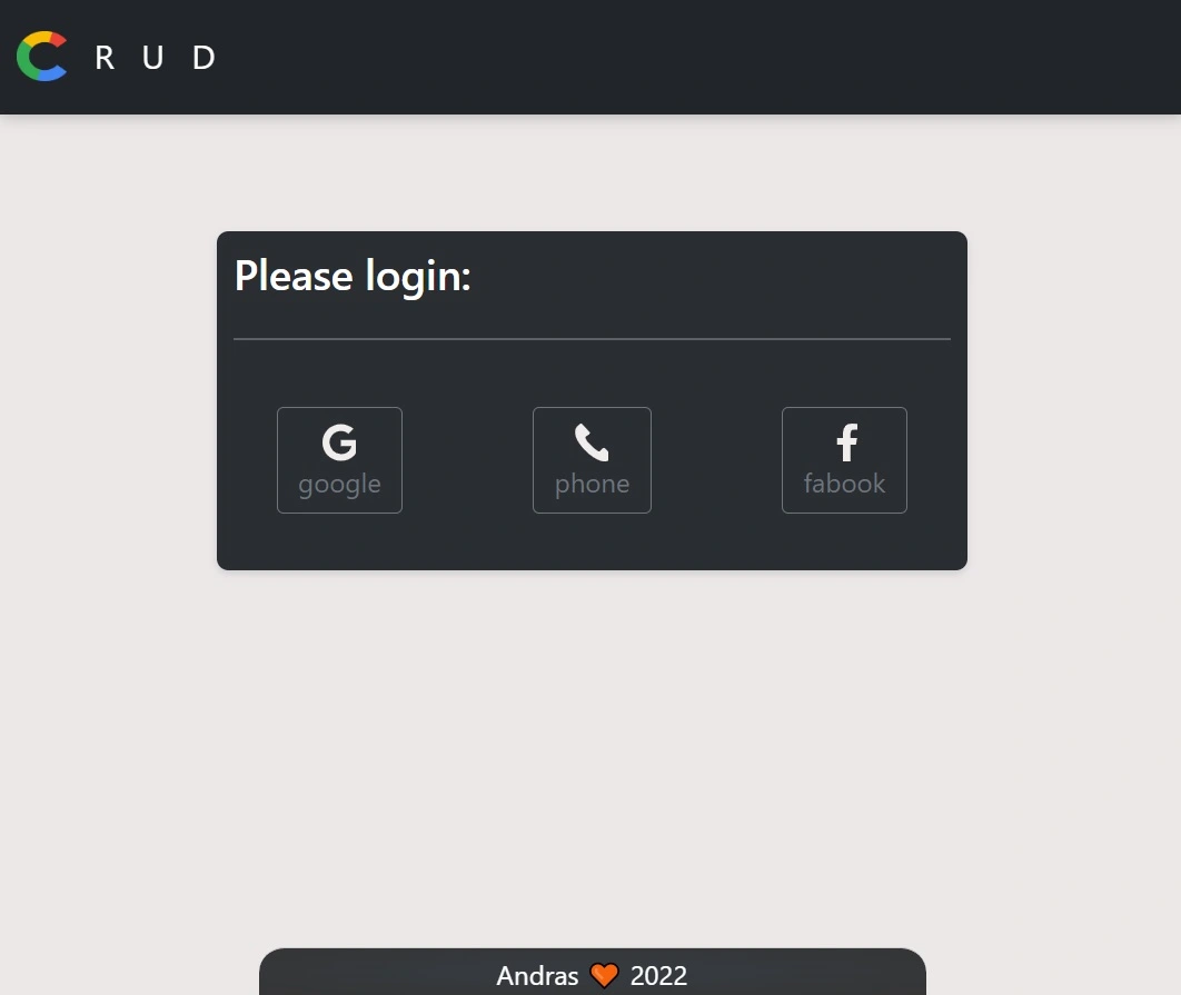
Crud
Crud, Auth and Fire
This project demonstrates a simple CRUD (Create, Read, Update, Delete) React application
with a backend powered by Firebase. I chose Firebase for its ease of integration and
robust features, allowing me to focus on the core functionality while leveraging its
capabilities.
After carefully planning the project's requirements, I implemented the CRUD
functionality using React components and Firebase's Realtime Database. I then integrated
Firebase authentication (Google, Facebook, OTP) to secure the application and added
protected routes to restrict access to unauthorized users. The app is designed with
React Bootstrap to ensure a responsive and user-friendly interface.
For a more in-depth breakdown of the project's evolution, features, and practical examples, please
go to the app and click on the logo. You'll find both an 'About' and an 'More About' section.
Key Features:
- Authentication - Implements user authentication using Firebase, allowing users to sign in via Google, Facebook, or by phone using one-time password texts.
- Protected Routes - Restricts access to certain routes based on user authentication, preventing unauthorized access to sensitive data.
- Context Provider - Utilizes a context provider to manage user authentication state, ensuring consistent access across the application.
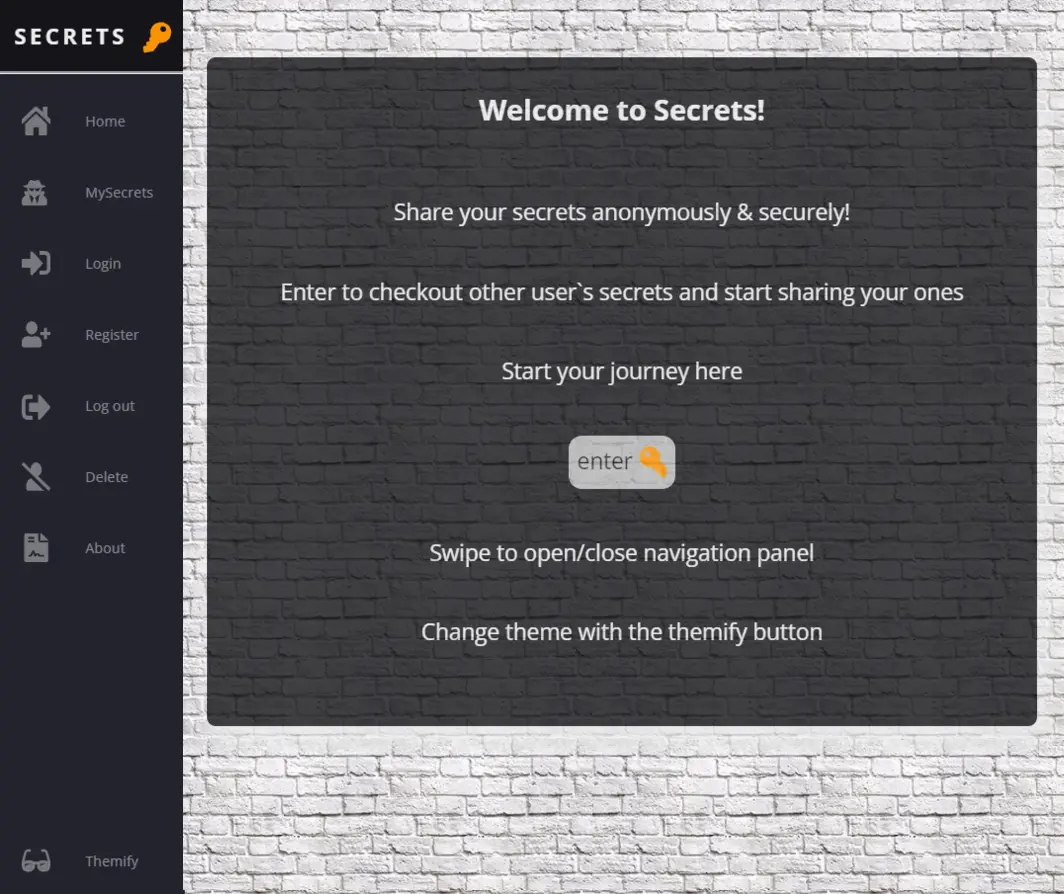
Secrets
MongoDB, Node, Express with EJS
During my final stages of self-study on Udemy, I was intrigued to push a particular
project further—one that involved MongoDB, Node, Express, and EJS. Originally, it was a
simple CRUD application using MongoDB for the back-end and EJS for the front-end.
However, I made significant enhancements, adding user authentication with session
cookies to ensure users could interact only with their own content while still being
able to view other users' posts. Once authenticated, users remain logged in unless the
cookie expires or the browser is closed.
To elevate the project further, I incorporated animations, themes, SVGs, and a dynamic
navigation bar with swipe functionality using hammer.js. These additions brought the
app to life and improved user engagement. After sharing the project link in a study
group, I was excited to see many 'secrets' being posted, which highlighted the
interactive nature of the app.
Overall, I am proud of the outcome—not only for the technical achievements but also for
how it resonated with users. You can read a detailed report and learn more about the
challenges I faced in the 'About' or 'Read More' sections of the app.
Deployed on
Heroku's eco-dyno, please note that it may take a few seconds for the server to wake up.
To see the shared secrets, simply click the button below the video.
Key Features:
- Authentication - User authentication with session cookies, allowing personalized content management. Includes Signup, Login, Signout, and the option to delete the account.
- Content Management - CRUD operations with MongoDB, enabling users to share and view posts securely.
- Dynamic UI & Navigation - Enhanced user interface with animations, themes, and SVGs, plus swipe functionality via hammer.js.
- User Engagement - Seamless navigation with a dynamic navbar and responsive design to improve user interaction.
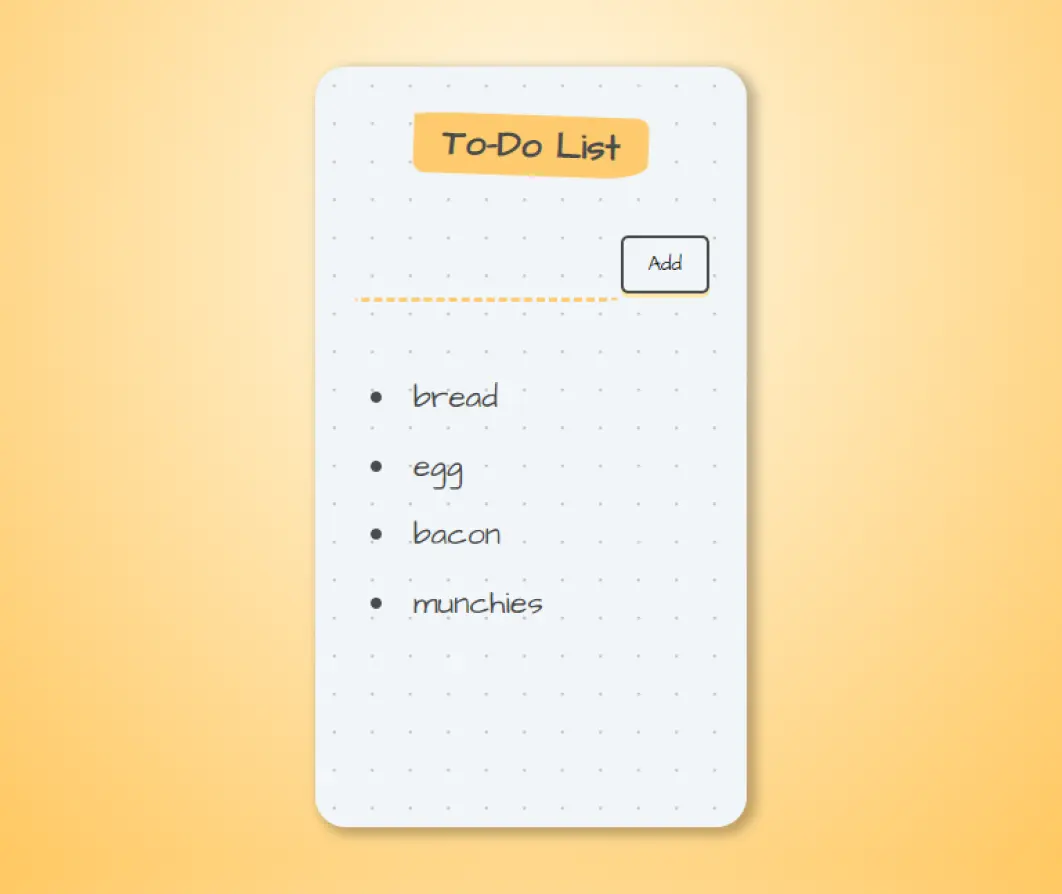
To-do list
A challenge with React
This project started as a coding challenge during my studies. The task was to create a simple React app, focusing on the correct use of props and the spread operator. I love working with React because it provides instant updates without needing a page refresh or redirect. After completing the challenge, I wanted to take it further by adding a back-end. This project actually inspired me to build a CRUD app later on. While the app hasn't been deployed, I'm still able to share it with you through an embedded preview. Please click the button to check it out.
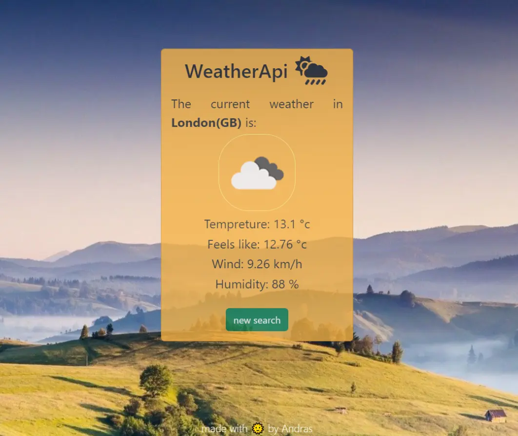
WeatherApi
Openweather Api calls with Bodyparser, Express and Ejs
As part of my studies on Udemy, I developed an app that makes
API calls to Openweather using BodyParser, Express,
and EJS.
The project originally handled API responses with res.write(), but I enhanced it by
adding Bootstrap 5 for styling and EJS for better handling of potential user input
errors like typos. I styled the app with a sleek, transparent design over a pretty
background, making it a great standalone project. In the future, I plan to rebuild it
with React and React Native, including a 5-day forecast feature for added functionality
at the click of a button.
Key Features:
- API Integration - Fetches weather data from OpenWeather using BodyParser and Express.
- Dynamic UI - Displays results dynamically with EJS, allowing for personalized content.
- Error Handling - Manages input errors (e.g., typos) for smoother user experience.
- Aesthetic Styling - Features a transparent, visually appealing background.
Next project?
Freecodecamp, Codewars
Over the past five years, I`ve dedicated a significant amount of time to studying and applying what I`ve learned to improve my skills. Given my current time constraints, I`ve decided to focus on sharpening my knowledge through challenges on Codewars while continuing to learn on freeCodeCamp. Although I have plenty of project ideas—like learning more about React Native and creating indie games with Unity—for now, I`ll concentrate on skill refinement and consistent learning. Once I have more time, I`ll dive into new projects and share them here.
T-B-A
In the meantime, please feel free to try one of my first apps I made in the beginning of my coding journey.